
Svelte was published about three years ago by Rich Harris and is already an “old hand” by JavaScript standards, or at least not a new technology anymore. But it feels like it only had its breakthrough this year with the release of version 3. There are several reasons for the popularity:
- Svelte offers components that are resource-saving and performant.
- It relies on established standards: HTML, CSS and JavaScript.
If you have never heard about Svelte before, I have published a beginner’s guide in German. For teams the question might arise how they can just get started using Svelte in production immediately. This approach will provide a way to evaluate the strengths and weaknesses of the solution and gain some profound experience. A full change to using Svelte might still be considered later. In this article I would like to show how a Svelte project can be set up and how we can integrate it into an existing application via Web Components (see box).
Web Components
Web Components is a collective term for three technologies that allow developers to create their own HTML elements. Those are:
- Custom Elements: JavaScript APIs that allow you to create your own elements.
- Shadow DOM: JavaScript APIs that allow you to create a “shadow DOM”. This is an additional DOM (Document Object Model), which makes it possible to define behavior and styling privately and avoid collision with the rest of the DOM.
- HTML Templates: The HTML elements <template> and <slot> can be used to create HTML templates that are not directly rendered, but can serve as templates for custom elements, for example.
Svelte
Svelte is not just another component framework that stands out from the competition simply because of an alternative way of thinking or different use of technologies, but it is a compiler. However, if you would compare it to other compilers like elm, you will also not do justice to Svelte: The languages used should already be well known, since they are HTML, CSS and JavaScript.
The approach to use a compiler instead of a runtime has some advantages for developers, e.g.:
- Svelte is really reactive. Changes are not calculated via a virtual DOM, which then updates the real DOM. Instead, Svelte components interact directly with the DOM.
- The magic, which other frameworks handle in runtime, is not necessary at all when using Svelte. Svelte does work completely without its own runtime and therefore needs less resources.
Svelte is also attractive for developers because it is possible to adapt the technology stack used in Svelte to their own needs. HTML can be replaced by Pug, CSS by SASS and, since July 2020, JavaScript by TypeScript.
Integrate Svelte into existing projects
The integration of a new technology like Svelte into an existing frontend should require as few changes as possible to the existing project setup. Therefore, we leave the build process unchanged and integrate the components as a dependency into the project. This also makes it easier to undo the changes later. We can then integrate our Svelte components into the code as Web Components. This ensures that we only have to pay attention to a few things during integration.
We already know the possibility of creating web components from Anguweb componentslar, React or Vue. In these cases, however, the integrated runtime makes for comparatively heavy components. Since Svelte does not need its own runtime, the generated Web Components are also smaller and save resources. If we look at the bundle size and performance, created with Svelte clearly beat the alternative created with large frameworks. In addition, we rely on an established web standard for Web Components, which is supported by (almost) all browsers and can be retrofitted with a polyfill if required.
No matter if a team wants to migrate to Svelte or develop a common component library that can be used in several applications: Svelte allows an easy integration into the already existing frontend.
A pattern library in Svelte
Since this article is primarily about the integration of Svelte into a project and less about features that Svelte provides, we will show the integration using the example of a pattern library. Since Svelte components are primarily based on HTML, CSS and JavaScript, components can be created quickly. Another argument for Svelte is the very good support for animations, which it brings out of the box. The pattern library used here will include the following:
- integration of Sass and TypeScript to work with a modern development environment
- a test setup with testing-library to test new components
- a storybook integration to document the components in a useful way
- we will be publishing the pattern library using npm, so that it can be installed and used by other teams via npm without the need for major customization of the respective build process
In the end, we integrate the created pattern library into a React application created with Create React App. This is basically similar for Angular, Vue and co.
Projekt-Set-up
The basis for our pattern library is a Svelte project. We set it up with Rollup as a module bundler, since most examples with Svelte also rely on Rollup. However, the use of webpack is equally possible and can be done in a similar way.
Rich Harris, the creator of Svelte and Rollup, has created another tool, degit, which we will use now. With degit, a copy of a Git repository can be created and downloaded. We use it to get a template for Svelte components as the basis of the project. Afterwards, we have all dependencies installed by the package manager of our choice (npm in this article):
npx degit sveltejs/component-template em-pattern-library

cd em-pattern-library

npm install
Creating a component for this example
We will be using a button as a component example for this article. The button will have a title and triggers a customOnClick event when clicked (listing 1).
<script>
  import { createEventDispatcher } from 'svelte';
  // title is provided externally
  export let title: String = "";

  // Event handling
  const dispatch = createEventDispatcher();

  function dispatchClick(event) {
    dispatch("customOnClick", {text:"some custom text"});
  }
</script>

<style>
  button {
    background-color: rgba(0, 125, 141, 0.75);
    color: #efefef;
    padding: 0.5rem 1rem;
    border: 0;
    border-radius: 4px;
    box-shadow: 1px 1px 2px 1px #ccc;

  &:hover {
    background-color: rgba(0, 125, 141, 1);
  }
  }
</style>

<button on:click={dispatchClick}>{title}</button>
The event we trigger in the component (customOnClick) plays a role later in the article. We save the file as src/Button.svelte. Before making the button available for other projects as a web component, we’ll adjust the setup to use TypeScript and Sass instead of JavaScript and CSS.
Using TypeScript and Sass in Svelte
TypeScript and Sass are very popular in numerous projects. Svelte makes it possible to integrate both in one project thanks to svelte-preprocess. As mentioned earlier, Svelte natively supports HTML, CSS and JavaScript. To allow developers to customize their own development environment, there is the Svelte Preprocess API. It is possible to transform the content of the markup as well as the script and style tags. svelte-preprocess uses this API and already supports Sass, Stylus, Less, CoffeeScript, TypeScript, Pug, PostCSS and Babel out of the box with a standardized configuration. For developers, this means less effort in configuring the build and high flexibility in development. The installation of svelte-preprocess is done as usual with the build tool of our choice:
npm install --save-dev svelte-preproce
After that we only have to adjust the rollup configuration and set svelte-preprocess as preprocessor in Svelte:
import autoPreprocess from "svelte-preprocess";
// …
plugins: [
svelte({
preprocess: autoPreprocess(),
}),
IDE Support
IDEs that support the Language Server Protocol can be used to work with Svelte. In recent months, the Svelte team has put some work into supporting the protocol here, which provides a solid foundation for developers. The extensions for numerous IDEs such as VSCode or IntelliJ are also helpful.
The VSCode extension for Svelte is relatively sophisticated and the plug-in reads the Svelte configuration (svelte.config.js). To configure VSCode for this, the svelte.config.js file must be created and have the following content:
const autoPreprocess = require("svelte-preprocess");
module.exports = {
preprocess: autoPreprocess(),
};
Styling Svelte components with Sass
Especially with a pattern library it can be very helpful not to be limited to CSS but to be able to use Sass as well. In order to style a component with Sass, we just need to install node-sass (alternatively just sass) and adjust the style tag in the component:
npm install --save-dev node-sass
In the example component, we can now use the type attribute with the value text/scss in the style element to indicate that Sass should be used. Of course, we can still use CSS here if we don’t need any of the features of Sass (Listing 2).
<style type="text/scss">
  $button-light:rgba(0, 125, 141, 0.75);
  $button-hover:rgba(0, 125, 141, 1);
  $text-color: #efefef;

  button {
    background-color: $button-light;
    color: $test-color;
    // usw.

    &:hover {
      background-color: $button-hover;
    }
  }
</style>
Svelte components with TypeScript
TypeScript is an established and popular programming language and can also be used in Svelte since July 2020. The integration is a bit more complicated than that of Sass and requires an adjustment to the rollup configuration in addition to the usual configuration for TypeScript in the tsconfig.json file. For TypeScript integration, we need to install the following additional dependencies in the project:
npm install --save-dev @tsconfig/svelte typescript @rollup/plugin-typesc
In the rollup configuration, we add the TypeScript plug-in (@rollup/plugin-typescript) and change the input to a TypeScript file if necessary. We use a flag to specify whether source maps should be generated. In this example, we make this dependent on the environment variable NODE_ENV (Listing 3).
import svelte from "rollup-plugin-svelte";
import resolve from "@rollup/plugin-node-resolve";
import pkg from "./package.json";
import autoPreprocess from "svelte-preprocess";
import typescript from "@rollup/plugin-typescript";

const PRODUCTION = process.env.NODE_ENV === "production";

const name = pkg.name
  .replace(/^(@\S+\/)?(svelte-)?(\S+)/, "$3")
  .replace(/^\w/, (m) => m.toUpperCase())
  .replace(/-\w/g, (m) => m[1].toUpperCase());

export default {
  input: "src/index.ts",
  output: [
    { file: pkg.module, format: "es" },
    { file: pkg.main, format: "umd", name },
  ],
  plugins: [
    svelte({
      preprocess: autoPreprocess(),
    }),
    typescript({ sourceMap: !PRODUCTION }),
    resolve(),
  ],
};
For this we set the environment variable NODE_ENV in the scripts block of the package.json file:
// ...

"scripts": {

"build": "NODE_ENV=production rollup -c

},

// ...
To configure TypeScript, all that is missing now is the tsconfig.json file. Svelte brings a pre-built configuration here, which we use. A minimum executable example looks like this:
{

"extends": "@tsconfig/svelte/tsconfig.json",

"include": ["src/**/*"],

"exclude": ["node_modules/*"]

}
Depending on our customization in the rollup configuration (input), we now only need to rename the index.js in the src folder to index.ts. Now TypeScript can be used in the components if needed. Similar to the Sass integration, we also need to add an attribute in the script element for TypeScript (lang=”ts”).
<script lang="ts">

import { createEventDispatcher } from 'svelte';

const dispatch = createEventDispatcher();
export let title: String = “”;
function dispatchClick(event): void {
dispatch(“customOnClick”, {text:”some custom text”});
}
</script>
This is all we need so that components can be created in the project with the help of TypeScript and Sass. Now we could go right ahead and develop components, but with an application that is to be used productively, the following question probably arises first: How can I test my components?
Set-up for testing
The current project already allows us to create svelte components. However, if we want to use the code productively, a suitable test setup should be a given: We want to make sure that our components work as expected for our users. Implementation details should be ignored here as much as possible, so that refactoring our application does not affect the tests. With testing-library we get the right tool for this, and it also provides us with an integration for Svelte.
As a test runner, we use Jest. The tool was originally developed by Facebook and is becoming increasingly popular. Instead of Jest, Mocha could also be used. Those who prefer to rely on Cypress can also do so with a few adjustments. To get testing-library and Jest working in our project, we first install the necessary dependencies in our project:
npm install –save-dev jest svelte-jester @testing-library/jest-dom @testing-library/svelte
Now we can freely choose between the setup for TypeScript and the one for JavaScript (with Babel). Since both have their raison d’être, I’ll describe both of them below.
Testing with TypeScript
If you want to use TypeScript, you’ll also need the following dependency:
npm install --save-dev ts-jest @types/jest
The Jest configuration (jest.config.js) uses svelte-jester to handle the Svelte components and ts-jest to support TypeScript in Jest (Listing 4).
module.exports = {
  preset: "ts-jest",
  testEnvironment: "jsdom",
  transform: {
    "^.+\\.svelte$": [
      "svelte-jester",
      {
        preprocess: true,
      },
    ],
    "^.+\\.ts$": "ts-jest",
  },
};
In the TypeScript configuration, we also store the types for jest and jest-Dom so that we can use them in our tests without importing them:
{

"extends": "@tsconfig/svelte/tsconfig.json",

"compilerOptions": {

"types": ["jest", "node", "@testing-library/jest-dom"]

},

"include": ["src/**/*"],

"exclude": ["node_modules/*"]

}
Once we added the types, we can use testing-library the same way we are used to from other frameworks. A first test here could be to check whether the set title is also rendered in the component. We place the code from Listing 5 in the same folder as our button. In this case as Button.test.ts.
import "@testing-library/jest-dom/extend-expect";
import { render } from "@testing-library/svelte";
import Button from "./Button.svelte";

describe("Button component", function () {
  it("assigns the title as expected", function () {
    const expectedTitle = "Test Button";
    const { getByText } = render(Button, { title: expectedTitle });

    expect(getByText(expectedTitle)).toBeInTheDocument();
  });
});
Testing with JavaScript
In a setup without TypeScript, based purely on JavaScript, we need Babel and the following dependencies:
npm install --save-dev @babel/core @babel/preset-env babel-jest
The jest.config.js uses babel-jest accordingly and also svelte-jester to be able to process the svelte components:
module.exports = {

transform: {

'^.+\\.svelte$': 'svelte-jester',

'^.+\\.js$': 'babel-jest',

},

moduleFileExtensions: ['js', 'svelte'],

}
In addition to Jest, we also need to configure Babel in this case. This is done in babel.config.js, as shown in Listing 6.
module.exports = {
  presets: [
    [
      '@babel/preset-env',
      {
        targets: {
        node: 'current',
        },
      },
    ],
  ],
}
Since we did not specify any type information in the example above, we can create the same test with JavaScript. Only the file extension must be changed to .js. Regardless of the chosen programming language, we now add a script to the package.json to be able to execute our tests:
// ...

scripts:{

// ...

"test:"jest"

}
Storybook
A good documentation is essential to simplify usage for a pattern library. Storybook is one of the most widely used solutions for that and offers, among other things, a Svelte integration. Installation and configuration can be automated via npx:
npx sb init
You don’t need anything else: Storybook installs all the necessary libraries and creates a sample project, in our case suitable for Svelte. A suitable story for our button could look like Listing 7.
import Button from "../Button.svelte";

export default {
  title: "PatternLibrary/Button",
  component: Button,
  argTypes: {
    title: { control: "text" },
  },
};

export const Default = () => ({
  Component: Button,
  props: {
    title: "my custom button",
  },
  on: {
    customOnClick: function (e) {
      console.log(e);
    },
  },
});
We create the story in /src/stories/Button.stories.js. In the package.json we make sure that we can start Storybook by adding the appropriate command in the scripts block.
 // ...

"scripts": {

// ... additional commands

"storybook": "start-storybook -p 6006",

},
After executing npm run storybook in the terminal Storybook starts and all stored stories are displayed on localhost:6006 (fig. 1).
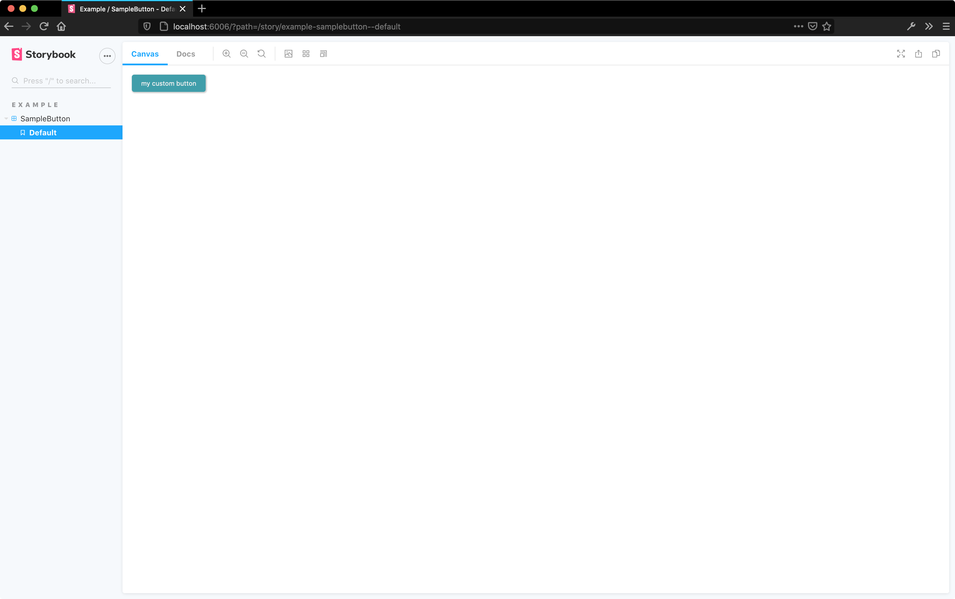
Fig. 1: example project in storybook</fig caption>
What we did so far
If we compare our previous setup with established frameworks such as Angular, Vue or React, the effort is somewhat larger. On the other hand, we rely on an established technology stack that some teams surely already know from other projects: TypeScript and Sass for component development and testing-library for testing. Writing a documentation is simplified by the use of Storybook. The next step is now to deploy the already developed component as a web component so that we can use it in another project.
Creating a web component in Svelte
To create a web component in Svelte, we first need to adjust the rollup configuration again to enable custom element creation:
plugins: [

svelte({

// … rest of configuration

customElement: true,

}),
In the Svelte component that we want to use as a custom element, we now add the following line of code:
<svelte:options tag="em-button"/>
Our component can later be used as <em-button>. The important thing to remember when naming the tag, as is common with custom elements, is that a “dash” must be part of the name in order for the component to be registered as a custom element. In this case, we take em as the prefix. In the index.ts in the src folder, all we have to do now is export the component:
export { default } from "./Button.svelte";
Integrating the web component into a static HTML page
To check if our setup works, we will start with a local test: We integrate the web component in an empty HTML page and check if everything works. The first step for this is to build the project using our build tool:
npm run build
The script should create a folder dist and in it, among other things, a index.js file. In order to test our component locally, it is sufficient to create index.html, include the generated index.js there and use our button (Listing 8).
<!doctype html>
<html lang="en">
  <head>
    <meta charset="utf-8">
    <title>Entwickler Magazin Button</title>
    <base href="/">
    <meta name="viewport" content="width=device-width, initial-scale=1">
  </head>
  <body>
    <em-button title="click me"></em-button>
    <script type="text/javascript" src="dist/index.js"></script>
  </body>
</html>
With the help of npx we start a HTTP server for the current directory and can open the page on localhost:8080 (live-server changes the port here if necessary and logs it to the console). I like to use live-server for this because it automatically reloads the page after changes to the code:
npx live-server
To interact with our custom event (customOnClick), we can add an additional script element in the HTML file. Here we can then output, for example via console.log, when our event is triggered by our web component:
<script type="text/javascript">

document

.querySelector("em-button")

.$on('customOnClick', console.log)

</script>
Looking at this code fragment, you may notice the use of $on, which is not the familiar way to respond to events (instead, you would expect an addEventListener here). The reason for this is that Svelte provides this method for its components to listen for events. A “normal” addEventListener would not work. This is due to the fact that our web component uses the Shadow DOM. Events sent via the Svelte dispatch cannot leave it. However, this is due to the current Svelte implementation, and it is hoped that we will be spared this detour by a future version. There are now two options for integrating Svelte web components:
- use the variant described here with $on.
- implement the event handling yourself, so that the components used behave according to expectations.
While using $on is relatively simple, you commit a little more to Svelte and will see some unexpected (namely, no) behavior when using addEventListener. The alternative requires a few lines of additional code in each component.
Implement event handling yourself
In our component, we use createEventDispatcher to create a function that we can use to dispatch events. However, in our case, the created events do not leave the Shadow DOM. This may be a desired behavior, but certainly in some scenarios you want to be able to react to the events.
To be able to trigger the event, we first need an element that serves as its source. To do this, we create a ref variable in the script block, which we bind to the button element using bind:this in the markup:
<script>

//.. other Code

let ref;

</script>

<button bind:this={ref} on:click={dispatchClick}>{title}</button>
The event is further handled in the dispatchClick function, where we first create a CustomEvent and then trigger it via dispatchEvent (Listing 9).
function dispatchClick(e): void {
  // vorher:
  // dispatch("customOnClick", { text: "some custom text" });
  // new:
  const event = new CustomEvent("customOnClick", {
    detail: { text: "some custom text" },
    bubbles: true,
    cancelable: true,
    composed: true, // this line allows the event to leave the Shadow DOM
  });
  ref.dispatchEvent(event);
}
As you can see, only a few additional lines of code are necessary here. However, it should be a team decision, how the event handling is implemented. No matter which variant a team decides on: We should be able to see our Svelte web component in the browser and react to events. The next step is to integrate the pattern library into another application.
Local development and deployment
It doesn’t matter where we deploy the pattern library, since we are relying on a web standard. Below, I’ll show the integration in a React application set up using Create React App. For this example, we’ll call the application react-with-webcomponent and create it using npx. This is done in a folder outside of our pattern library.
npx create-react-app react-with-webcomponent

cd react-with-webcomponent

npm start
Now we have to make our components available locally. To do this, we go to the folder that contains our pattern library and run npm link in the terminal. With npm link, a symlink is created from the global node_modules to the package in which the command is executed. The package can then be included under the name assigned in package.json with npm link package-name, so in our case with npm link em-pattern-library.
In the Create React app application, we can now include our pattern library with npm link em-pattern-library. Later, when the package is available via npm, we still need to run an npm install em-pattern-library here so that the application can be used without a locally linked library.
Publish package on npm
Now we just have to publish our package. This is possible via npm, but can also be accomplished via many other repository managers. To publish our package at npm, we first need an account there. After that we can login to the terminal via npm login and publish the package via npm publish.
If you want to be on the safe side here, you can also try an alternative to npm link: In the target project, for example our Create React App, you can just run npm install followed the project path, instead of using npm install em-pattern-library. So for example, npm install ../em-pattern-library if both projects are in the same folder. With npm install em-pattern-library you can install and use our pattern library everywhere.
Integration of the web component in React
After installing our package in the React application using npm (alternatively, npm link can be used), we can create a new component there that integrates our button (Listing 10).
import React, { useState, useEffect, useRef } from "react";
import "em-pattern-library";

function App() {
  const [count, setCount] = useState(0);
  const buttonRef = useRef();
  useEffect(() => {
    buttonRef.current.addEventListener("customOnClick", (e) =>
      setCount(count + 1)
    );
  });
  return (
    <div>
      <p>{count}</p>
      <em-button
        name="+"
        ref={buttonRef}
        // the classic onClick also works
        onClick={() => {
          console.log("on click");
        }}
      />
    </div>
  );
}

export default App;
In React, to be able to react to the customOnClick event triggered by the Web Component, we need to create a reference with useRef (buttonRef) and implement a classic event listener on it. This is the norm when integrating web components, because React has its own event system, and this allows us to bridge the gap. Fortunately, the classic onClick handler that React includes out of the box works as expected.
Downsides
Of course, there are downsides to using Svelte as a web component that should not go unmentioned. In addition to the somewhat cumbersome event handling, the following points should be noted:
- Globally defined CSS or CSS defined via the global modifier are not applied.
- CSS is not stored in a separate file, but is part of the JavaScript bundle.
- Custom elements are generally not suitable for server-side rendering.
- Content in <slot> elements is always generated, even if it is for example in a {#if …} block.
- Depending on the supported browsers, the appropriate polyfills must be included.
Conclusion
Teams that want to use Svelte in their applications can quickly reach their goal via the integration of web components. Svelte is also convincing due to its small size and remarkable performance. Development with Svelte is fun and can be easily adapted to any established technology stack. Teams that want to fully rely on Svelte later can easily migrate an application. All other teams rely on an established web standard with web components and should thus get a future-proof application.


